The Product
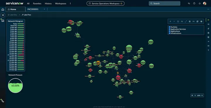
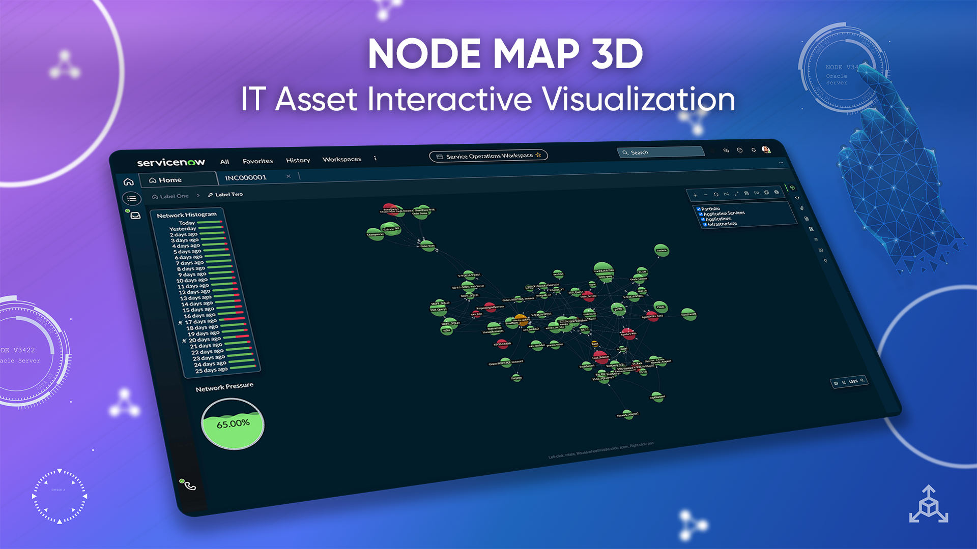
Node Map 3D helps IT administrators visualize, interact with, and query large sets of IT assets. Software teams increasingly run applications across distributed cloud environments, where a single incident can pass through services, databases, network devices, and ownership boundaries before anyone sees the root cause.
My Role
I led design end-to-end with UX, visual design, product management, engineering, and design leadership. We ran a focused research workshop with service-map experts, moved from lo-fi sketches into high-fidelity Figma prototypes, and validated the interaction model with infrastructure specialists before shaping it into a reusable platform component.
Results
User testing showed that administrators found the interactive 3D map more engaging and confidence-building than previous static node graphs. The force-directed unified map approach helped the project win the 2023 UX Design Awards Public Choice, and the component went on to support multiple ServiceNow workspace contexts.
Background
Most observability products still rely on static 2D node graphs. They can communicate structure, but become cumbersome when the user is investigating thousands of configuration items under time pressure. Large graphs flatten into visual noise: nodes overlap, labels compete, and the person loses the path they were following.
The opportunity was to design a service-map experience that felt built for investigation rather than display: compact enough to make complex infrastructure readable, interactive enough to support exploration, and structured enough to help teams act on incidents before they disrupt end users.
Approach
We started with a two-day research workshop to understand current offerings, map administrator use cases, and pressure-test more futuristic concepts with infrastructure experts. From there, I prototyped the interaction model before polishing the visual design, using simple node-and-link flows to test how a person would move through a graph of a hundred, a thousand, or ten thousand nodes. A few principles came out of that:
- Focus over overview. Most of the time the user cares about a small region of the graph, not the whole thing. The default state shows a focused subgraph; the rest is reachable but not visible.
- Physics, not layout. A 3D force-directed layout lets the graph self-adjust based on relationships, creating a more compact and navigable visualization.
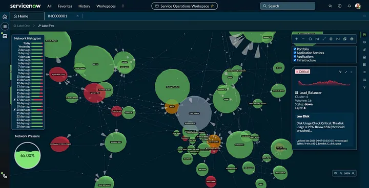
- Direct manipulation. Pan, zoom, drag, and move nodes give administrators natural mechanics for exploring the map instead of treating it like a flat report.
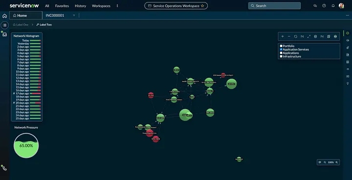
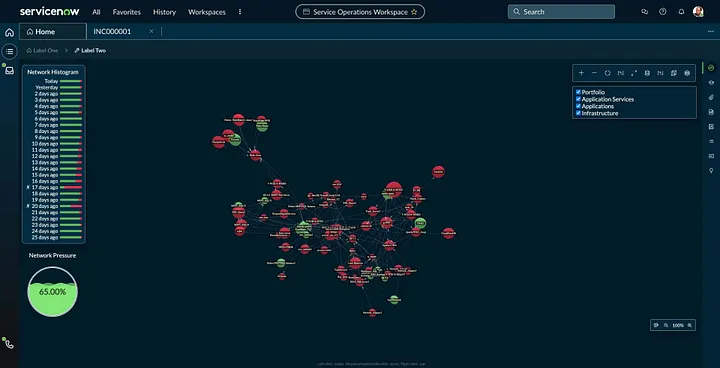
- Investigation controls. Histogram exploration and layer filters help users look across past events and analyze different kinds of nodes without leaving the map.
- One component, many contexts. Anything specific to ITOM or Security stays in those products. The Node Map itself only knows about nodes, links, and the small grammar.
The interaction model
Nodes carry the data: type, status, owner. Links carry the relationship. The user starts focused on a single node and expands neighbors outward. Pinning holds a node in place while the rest of the graph reorganizes around new focus. Layer filters let administrators compare node types, while the histogram gives them a way to investigate past incidents and draw patterns from event history. The same gestures work whether the graph is 30 nodes or 30,000.
Building it as a platform component
Treating Node Map as a reusable component changed how it was designed. The component takes a graph as input and exposes a stable set of events; the consuming product decides how to label nodes, what actions to attach, and what data to surface in detail panels. Once the contract was clear, picking up Node Map became a matter of mapping product data into the input schema, not redesigning the visualization. That's what made adoption across multiple workspaces practical.
Where it's used
Node Map has been picked up by product teams across the platform, including IT operations, security operations, HR service delivery, strategic portfolio management, AI orchestration, the CMDB, and service mapping. Each team uses the same underlying component, with their own data and labels.
Recognition
The project received the 2023 UX Design Awards Public Choice for its force-directed approach to manipulating a unified service map. It was also recognized internally with the ServiceNow Visionary Award, and was the subject of a Medium piece I wrote on the design approach.


Design artifacts