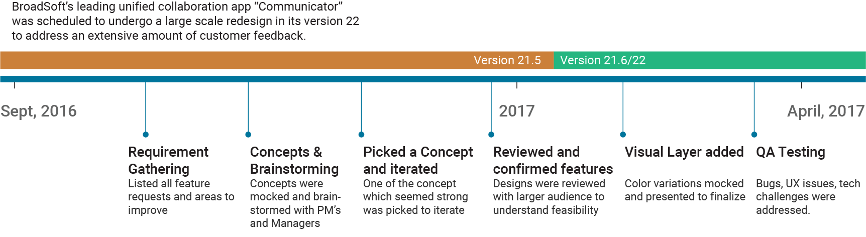
Communicator Redesign was a highly collaborative project involving PMs, Devs, Designers, and Managers, situated across the US, Europe, and India. I lead the project in tandem with a design manager in Sofia, Bulgaria. This was my first large scale project at Cisco, and I played a very proactive role to push bold designs to the management based on solid design rationales.
Process
Scope, Concepts, and Brainstorming
In the initial phases of the project, I met with previous designers of the product to understand what was the motivation behind the layout and features and how they saw it evolving. I received extensive input from the project managers and the designers to create a list of features that needed a redesign on a priority level. The need to redesign these features were echoed by Cisco customers in their feedback.
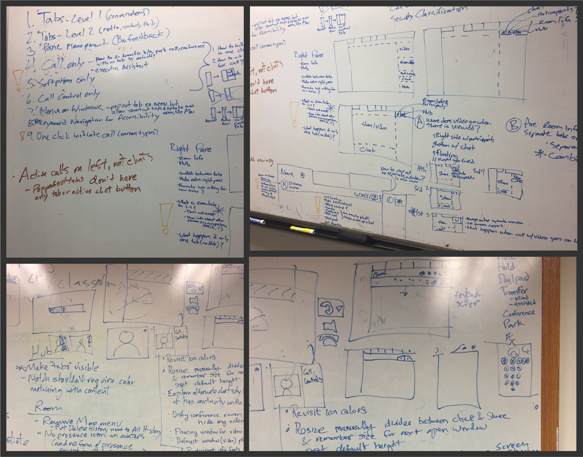
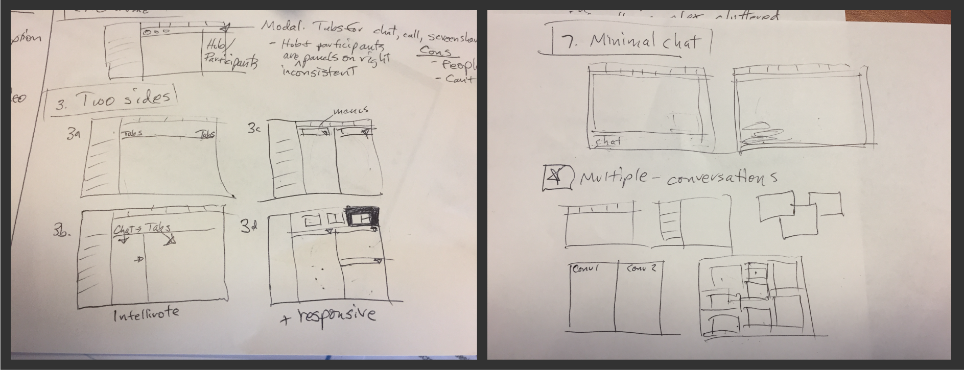
Lo-Fi Pencil Sketches
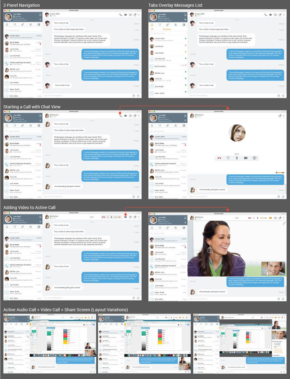
I started sketching various layouts that would solve the most complex scenario in the product. The most complex scenarios that the product would require to execute was a multi-user conference audio calls, with videos turned on and an ongoing screen share. I worked closely with my manager and the developers to understand the technical infrastructure and corner cases we have to consider.
Wireframes
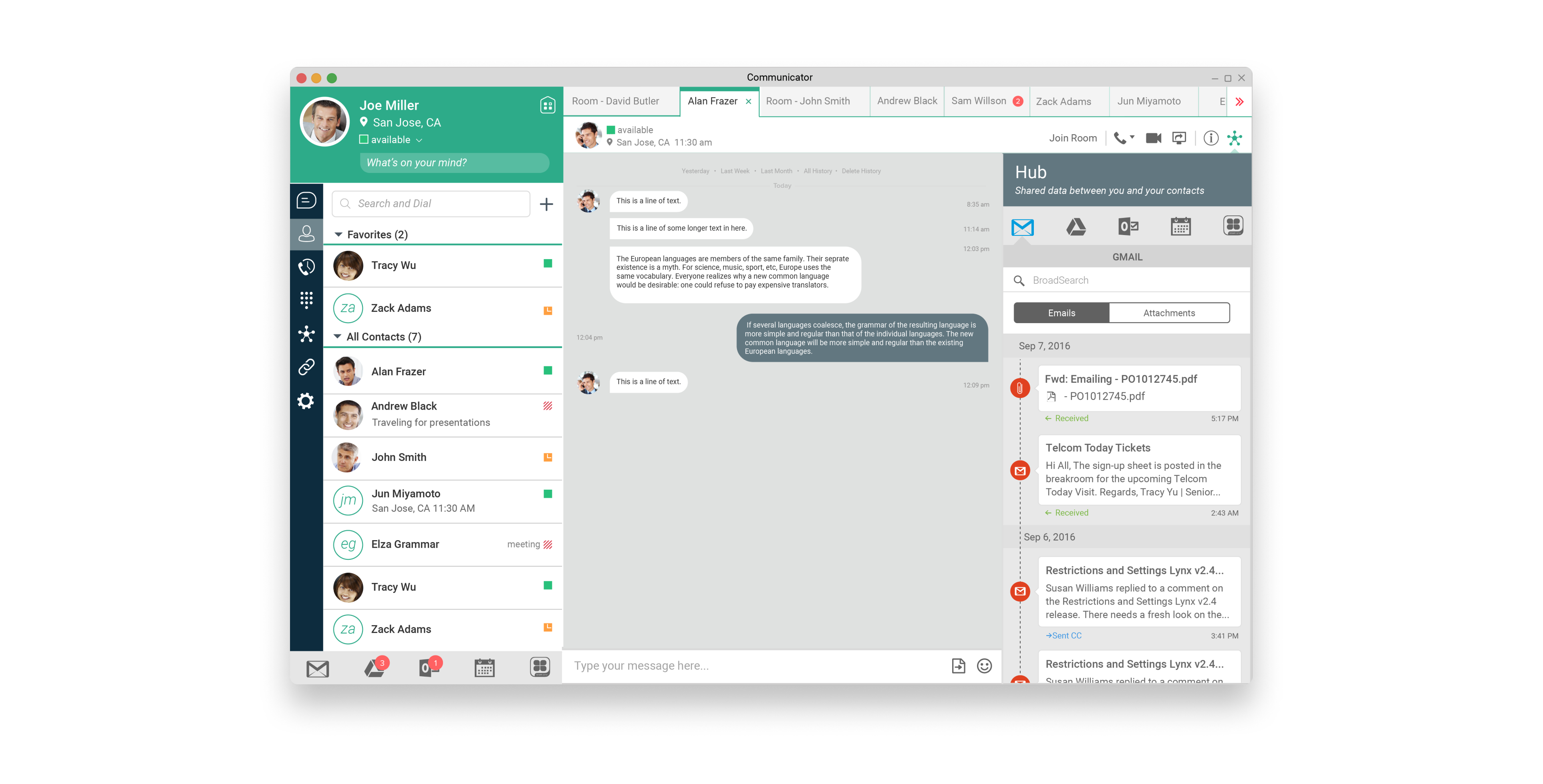
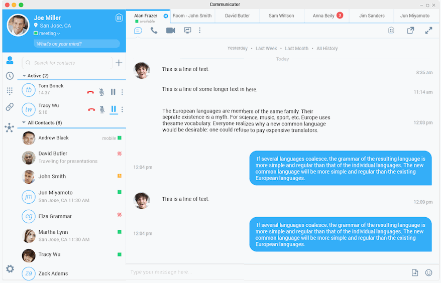
While creating the initial layouts for the new redesign I proposed the message list to be a central landing point for the users and they would not have to constantly switch back and forth between the message lists and contact list to search and chat. The contact list would a modular panel on top of the message list. This was a bold proposal for the communicator product and this approach was never tried before and if considered would need a significant amount of UX and development work to solve for every feature that would be affected by this approach. Considering the timelines and resources a middle ground was negotiated and aligned on by the stakeholders.
Usability Stress Test
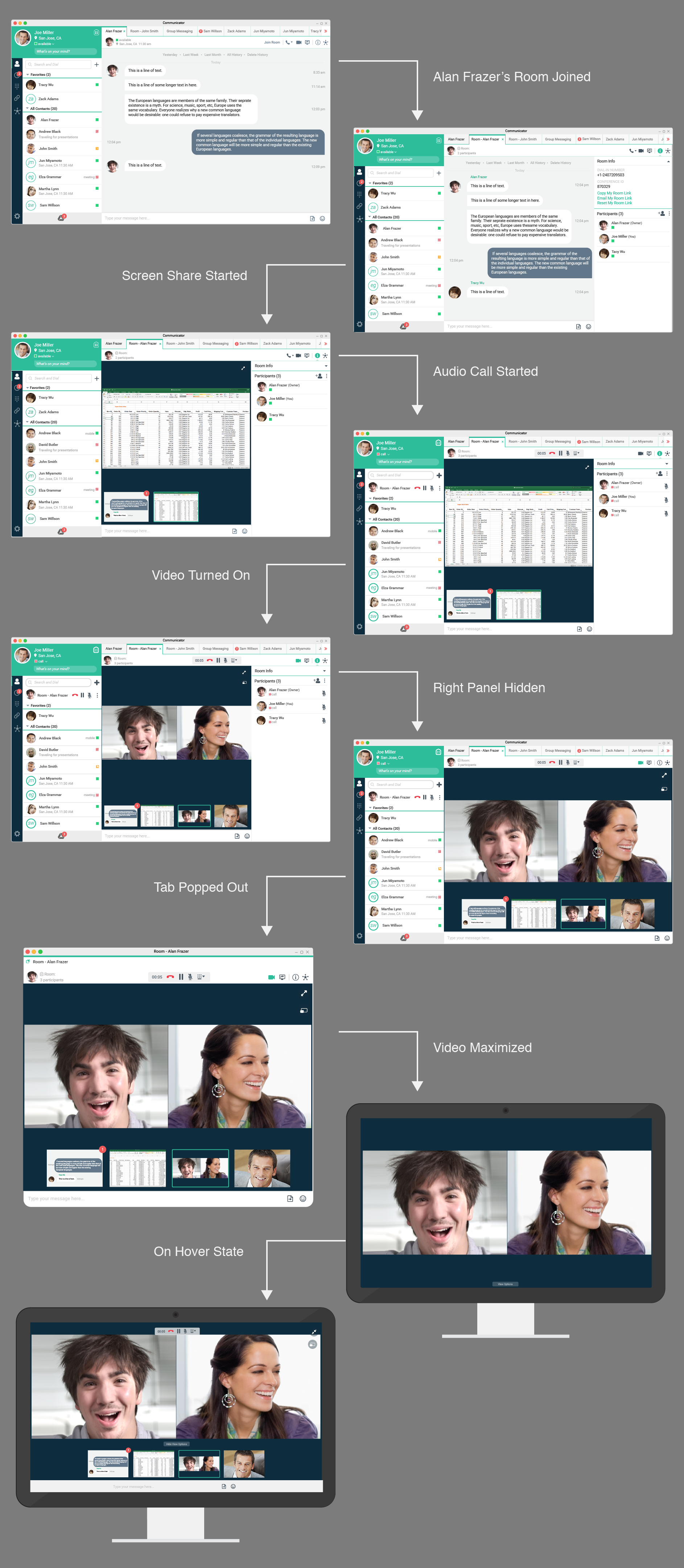
We decided to solve the most complex use case that could occur in the product and it would cover most of the other use cases. This use case was when a user starts a conference video call with a shared screen and then pops out the frame out of the app and then maximizes the window. Below shows the finalized version of this interaction.
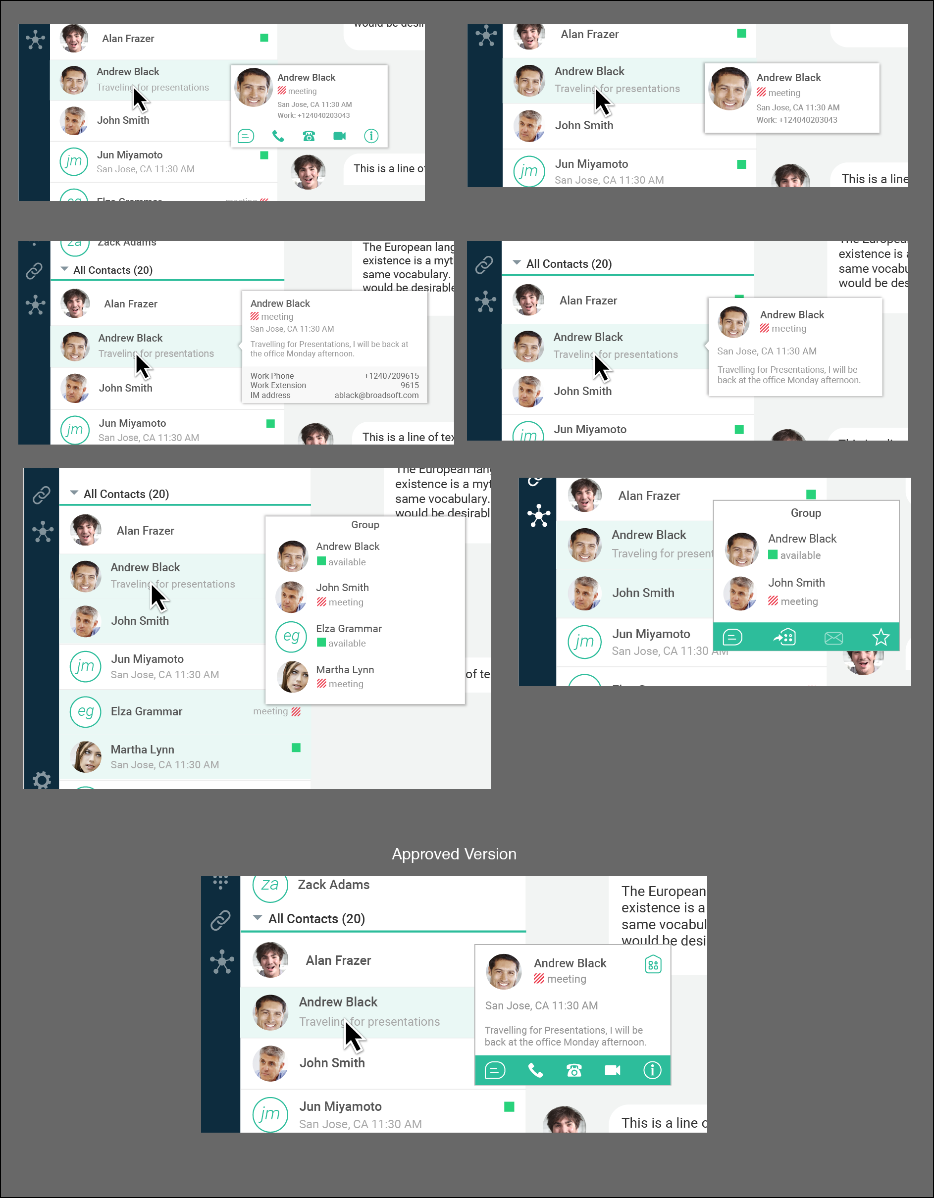
Contacts Pop-up Design
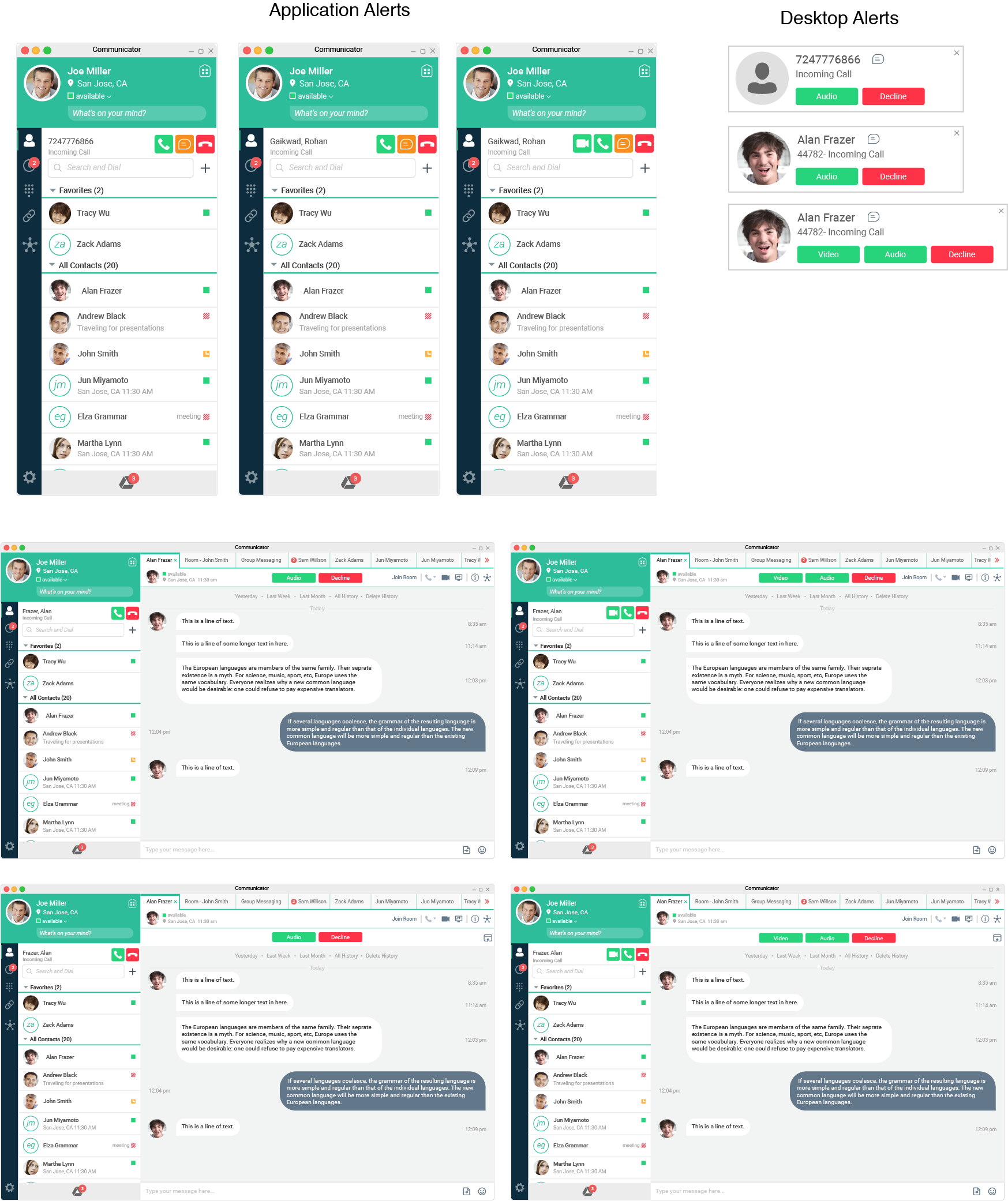
Incoming Call Alerts
Visual Explorations
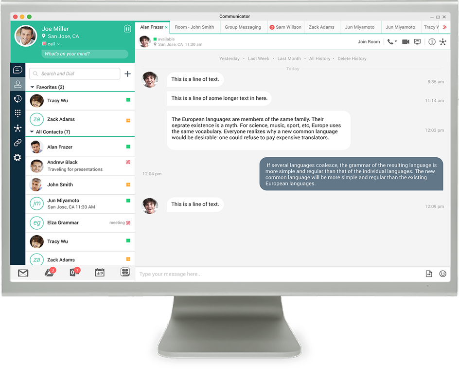
Communicator is a white label product and we had to be conscious of the limitations of color usage as these colors are customized according to customer requirements. I explored various color options and reviewed them with the stakeholders. We also consulted with the marketing team to maintain the branding strategy of the products. Finally, it was decided that green and dark blue-black color would be a suitable distinctive color combination that would be applied to the product. This color combination inspired a fresh outlook after the redesign.
Final Design
Milestones

Acquisition
Final biggest redesign effort of UC Communicator before getting acquired by Cisco

Design Leadership
Lead the design effort with 2 other UX designers and replaced the waterfall approach with an iterative design approach to software building

Learning
Closely collaborated with soft engineers to iteratively build software lead by design

Complexity
3 offshore teams, platforms including macOS, Windows, and numerous audio, video, collaboration features, and use cases

